
There are a lot of questions to be asked during the course of a PUWER assessment; there are questions about documentation, and health and safety management systems, questions about guarding, and electrical cabinets, and lighting, and maintenance. It can all be quite daunting, and that’s before you start to assess more than one machine!
Thorough PUWER assessments produce a lot of information, and it all needs to be collected, organised, interpreted and ultimately used to make consistently wise decisions about the hazards in front of us. So how do we do that in a thorough, standardised, and timely way?
We want to introduce you to a couple of tools we have developed at Knox Thomas to help us do just that:
The PUWER app and the PUWER dashboard.
PUWER app
The first challenge to be overcome is collecting data. As we all know, if you put bad data in, you’ll only ever get bad information out at the other end. And bad information is worse than useless when you’re trying to make good decisions.
We want the data we collect to be as complete as possible, and to be entered in a format that is as useful as possible for later processing and reporting. It also helps if it can be collected in a timely manner.
So, we have developed the PUWER app to help us.
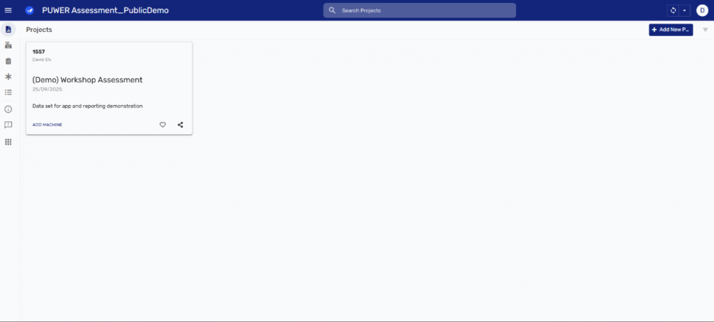
Our PUWER app works on IOS phones, Android Devices (including tablets) and in browsers. And the aim of the app is to guide an assessor through every stage of the PUWER assessment process.
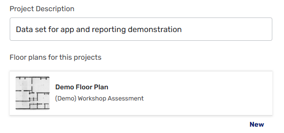
A user starts by creating a project within the app, setting project information such as name and description before being guided through any elements of the PUWER assessment that apply at the project level:

A key feature in this section of the app is the ability to upload floor plans to the app which allows the locations of assets to be recorded.
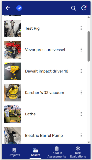
Once a project has been created, the assessor can then move onto to building an asset register – a key step in later PUWER assessments. Here information can be recorded about the assets being assessed including the ability to add photos of the machine and its nameplate.
This is also where uploaded floorplans come into play, giving you the ability to mark the location of the machine on the plan.
If a group of machines, or an assembly of machines, are going to be assessed together this part of the app includes the option to record all of the individual assets that make up the assembly.
Once assets have been added to the register PUWER assessment can begin for each of them.
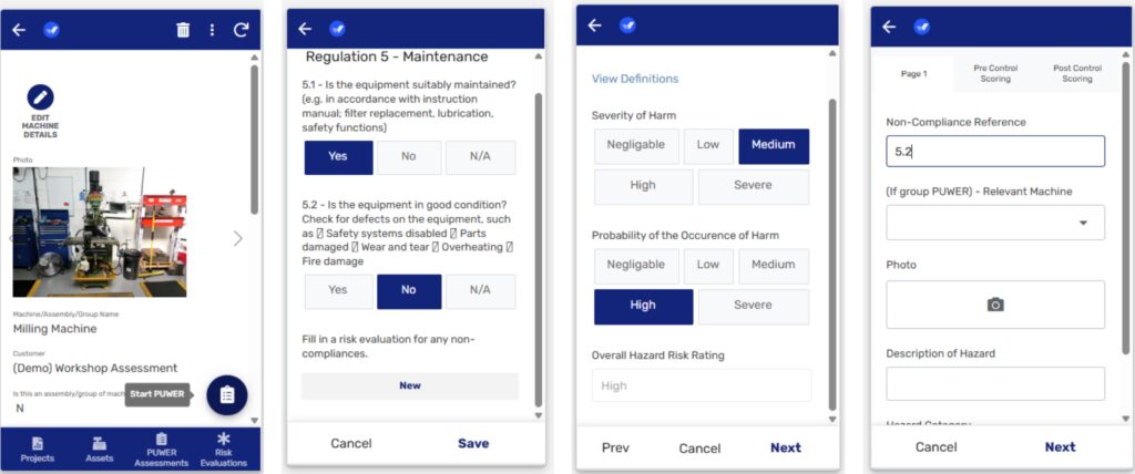
The purpose of this section is to guide assessors, question-by-question, through the Knox Thomas PUWER checklist as well as to record non-compliances and risk evaluations at each stage.
As the data is collected, it is stored outside the app in structured data tables. In our case we use a cloud-hosted SQL database, but the app can be set-up to use other database formats (even excel or google sheets) as long as the schema (the layout of columns and their data types) remains the same.
Of course, assessors don’t always have good internet access. Thankfully, the app works offline and will sync with its data storage when signal is restored.

Free Tool
Simple but Powerful PUWER Assessment App
A simple, easy-to-use app for checking PUWER compliance — usable on Apple, Android, and desktop browser. No intensive auditing or complicated report writing.
PUWER Dashboard
Collecting data is only half of the challenge. It’s all very well having robust, well collected, complete data, but if it’s presented as a wall of words and numbers then it can be very tempting to leave it unused.
Data is only helpful if we know what questions it can answer, and how to understand the answers it gives back to us.
To help achieve that we have also developed our PUWER assessment dashboard as one of our reporting tools.

The PUWER dashboard is a way to display data in an interactive way, and help customers to get the answers they need from the data we have collected.
This image shows the main summary screen of the dashboard. It provides an overall summary of the project including the number of risk evaluations, their associated risk ratings and how many of them are related to Health and Safety systems as opposed to machinery.
In the centre is the asset register for the project, which can be sorted according to risk ratings. This list is also colour coded to show the number of risk evaluations relative to the rest of the assets in the project. With a quick glance you can see which assets need to be a priority, which is often the most important question.
Sometimes a map is easier to understand than a list of assets, especially when a project includes a large number of machines and assessments. It’s possible, therefore, to view the same information on a floorplan.

The dashboard also offers alternative views with more detail. For example, if you select an individual machine, you can view the PUWER assessment for that machine in particular.
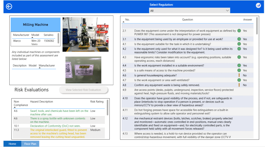
Both the list of risk evaluations and the checklist on the right can be filtered by regulation number, making it easier to access exactly the information you want as quickly as possible, including further details of individual risk evaluations:
In all of this the aim is to give the user the ability to get the answers he needs to the actual questions he has as quickly as possible.